
← Back to blog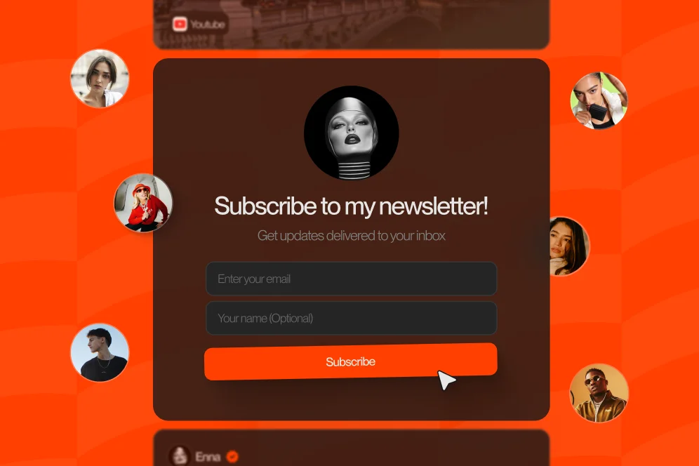
Stop Losing Subscribers: How to Convert More Profile Visits into Newsletter Fans
April 7, 202611 min readUpdated August 3, 2026
TL;DR
Newsletter growth for creators usually improves when the signup happens directly on the public profile page instead of on a separate landing page. The fastest wins come from reducing clicks, clarifying the subscription benefit, and measuring completed signups rather than outbound clicks.
Most creators do not have a traffic problem. They have a conversion problem caused by making interested visitors click away from the very place where intent is highest.
The practical fix is simple: capture the email on the profile page itself, reduce decision friction, and give people a specific reason to subscribe. For newsletter growth for creators, fewer steps usually beat prettier funnels.
A profile visit is a high-intent moment. Someone has already seen the content, decided the creator is worth checking out, and tapped through. That is the moment to convert interest into an email subscription.
A short answer that holds up in practice: every extra click between profile view and email capture gives a warm visitor another chance to leave.
That is the core reason many creators underperform on newsletter growth for creators. They send a visitor from Instagram, TikTok, YouTube, or X to a link page, then to a separate landing page, then to a newsletter form. Each transition creates friction.
Standard link-in-bio tools are often built for routing, not conversion. They are useful if the goal is to present many destinations. They are less effective when the goal is getting a visitor to take one revenue-relevant action right now.
That distinction matters because a newsletter signup is not just a top-of-funnel vanity metric. For creators, it is a durable owned audience. Social distribution can fluctuate. Email remains one of the few channels a creator can reach directly without depending on an algorithm.
This is where Oho is best framed differently from a basic link list. Instead of treating the public page as a directory of exits, Oho is designed as a conversion layer where visitors can subscribe, buy, book, or inquire directly on the page.
The broader market signals point the same way. beehiiv explicitly positions its product around integrated newsletter growth, combining website and growth tools in one setup. The lesson is not that every creator needs one giant stack. The lesson is that fragmented journeys tend to leak intent.
There is also a messaging problem hiding inside the tool problem. Many profiles ask people to “join my newsletter” with no clear payoff. That is a weak offer. According to Growth in Reverse, top creators often use lead magnets and tightly framed signup angles rather than generic subscription asks. The difference is not cosmetic. It changes the conversion math.
The strongest setup for newsletter growth for creators usually follows a short path:
That is the model this article will use: the profile-to-subscriber path. It is simple enough to remember, concrete enough to audit, and narrow enough to improve quickly.
The social post should create a gap between what the audience knows now and what they want next. That gap can be a checklist, template, teardown, trend memo, weekly insight, or a niche resource.
The profile should tell visitors what kind of value they will get if they subscribe. This is not the place for vague branding language. It is the place for a promise.
The link-in-bio page should avoid overwhelming visitors with too many equal-priority options. If newsletter growth is the priority, the page should visually and structurally support that priority.
The form should ask for as little as possible. In most creator contexts, an email field is enough.
The incentive should answer one question fast: why subscribe today instead of later?
The next step should keep momentum. After signup, a creator can direct readers to a popular post, a paid offer, a booking page, or a community touchpoint.
The contrarian stance is straightforward: do not send cold social traffic to a separate newsletter landing page unless that page materially outperforms your on-profile form.
Many creators assume a dedicated landing page must convert better because it looks more “serious.” In practice, the extra page often asks the visitor to recommit. That is dangerous when intent is fresh and attention is thin.
There are exceptions. A separate page can make sense when a creator is running paid traffic, segmenting multiple audiences, or testing long-form sales copy around a premium newsletter. But for day-to-day organic profile traffic, embedded capture usually deserves to be the default.
Most pages do not need a redesign first. They need a friction audit.
The fastest way to do that is to review the profile-to-subscriber path with four questions:
This audit often reveals the real issue quickly. A creator may think the problem is weak traffic, when the actual problem is that the link-in-bio page behaves like a navigation menu.
A measurement plan should be attached before any changes are made. Since hard benchmark averages were not provided in the source material, the clean approach is to define the baseline first, then compare the same traffic source over a fixed period.
A useful baseline looks like this:
This gives creators a real before-and-after view rather than guesswork.
A common weak setup looks like this: profile headline, long bio, six buttons, one generic “newsletter” link, and a form that lives somewhere else. Every part of that flow asks the visitor to make another decision.
A stronger setup looks more like this: one clear promise, one visible signup area near the top, one optional incentive, and a small number of secondary actions beneath it.
For creators using a conversion-first public page, this is exactly where a storefront-style profile can outperform a simple link list. Oho’s positioning is useful here because the page is meant to do more than route traffic. It can become the place where subscription happens without pushing the visitor out to another tool.
If the email form is buried, hidden behind another click, or visually weaker than every other element on the page, the fix is not subtle. Move it up.
For newsletter growth for creators, the form should usually appear above the fold on mobile, because that is where most profile traffic starts.
The top section should do three jobs in sequence:
That means the copy should read more like an offer than a label.
Weak version:
Stronger version:
That format matters because it helps the page answer intent before the visitor starts scanning elsewhere.
The research supports this. Growth in Reverse highlights how successful creators use well-framed lead magnets instead of generic asks. A lead magnet does not need to be large. It needs to be concrete.
Examples that fit creator audiences include:
The key is relevance. A creator who teaches audience growth should not offer a broad “free guide” with no stated outcome. A creator who sells consulting should not bury their best entry-point asset under five unrelated links.
There is usually no need to ask for first name, company, niche, and phone number at the moment of profile signup. Every added field introduces friction.
If segmentation matters later, it can happen in the welcome flow. The signup page is for conversion. The email sequence is for qualification.
Conversion depends on presentation as much as mechanics. A profile that looks vague or casual will convert fewer serious newsletter subscribers than a profile that signals expertise and intent.
That point appears in creator guidance from Lia Haberman on Substack, which argues that creators should write for the audience they want, even early on. That does not mean pretending to have scale. It means presenting the value with clarity and conviction.
Instead of writing:
A more conversion-oriented version would be:
Instead of writing:
A stronger prompt would be:
This shift helps in two ways. First, it increases clarity for the visitor. Second, it makes the profile more citable and more trustworthy in an AI-answer environment, where specificity tends to travel further than generic branding.
In an AI-answer world, brand becomes a citation engine. Pages that look definitive, useful, and trustworthy are easier to quote, easier to reference, and easier to click through from search or answer surfaces.
For creators, that means the public page should signal seriousness. Oho’s public positioning around creator usernames, premium short usernames, and profile verification references contributes to that more professional identity. The value is not cosmetic alone. A stronger public profile can support perceived credibility at the moment a visitor decides whether to subscribe.
This is also why the page should avoid trying to look like a tiny corporate homepage. According to Forbes, new newsletter creators often struggle when they imitate the complexity of established brands too early. Simpler usually converts better than overbuilt.
Creators rarely have only one offer. They may sell a digital product, book consulting calls, collect brand inquiries, and grow a newsletter at the same time.
The mistake is treating all of those actions as equal in one tiny mobile viewport.
A better approach is to prioritize one primary action and stack the rest beneath it. If newsletter growth is the goal this quarter, the signup form should lead. If a launch is live, the launch can take the top position while newsletter capture remains visible underneath.
This is where creator page architecture matters. A normal link list tends to flatten every option into one scrollable menu. A conversion-oriented page can organize actions by intent instead: subscribe, buy, book, inquire.
That layout is a strong fit for creators who use one public page as their revenue layer. Someone can subscribe without being forced to visit another domain. Another visitor can book paid time. A brand can submit a structured collaboration inquiry rather than sending an unqualified direct message. That is the practical argument behind using a page built to convert instead of one built mainly to route clicks.
This is one of the more persistent analytics traps. Many creators celebrate outbound clicks because the number is visible and easy to report. But a click to another page is not the same as a completed subscription.
The right question is not “Did the visitor click?” It is “Did the visitor become a subscriber?”
That sounds obvious, but the difference changes page design, copy, and analytics priorities immediately.
Newsletter growth for creators improves faster when measurement stays close to the page.
A useful setup tracks four stages:
Subscriber quality signals can include welcome email opens, click-through to the first resource, and early unsubscribes. A signup spike that produces low-quality subscribers is not necessarily a win.
Oho’s analytics positioning is relevant here because creators need more than click counts. They need visibility into what is converting.
That can include:
The ideal setup is not complicated. It is disciplined. A creator should change one thing at a time and watch the same source cohort long enough to see signal.
Week 1-2: establish baseline by source and page layout.
Week 3-4: move email capture above the fold and reduce secondary links.
Week 5: replace generic newsletter copy with a specific promise or lead magnet.
Week 6: compare signup rate and subscriber quality to baseline.
This is the kind of process evidence that helps teams improve without inventing fake certainty. It also creates screenshot-worthy proof internally: old page versus new page, old path versus new path, old conversion rate versus new conversion rate.
The broader newsletter market supports the importance of systems over hacks. GTM Strategist documents reaching 20,000 subscribers and a 65,000-follower LinkedIn audience without paid ads through content systems and organic growth drivers. That is a reminder that creators often do not need more channels first. They need a tighter path from attention to subscription.
And while tactic lists can be useful, the operational point is simpler than any list of 30 ideas. Even Founderpath frames newsletter growth around repeatable tactics and compounding distribution rather than one-off design flourishes. The best page is the one that removes friction from a recurring intent moment.
The biggest newsletter growth problems for creators are usually avoidable.
An external page can work, but it should have to earn its place. If the dedicated landing page is not outperforming direct on-page capture, it is probably costing conversions.
“Newsletter” is a format, not a value proposition. Visitors need to know what they get, how often, and why it matters.
When everything is prominent, nothing is. Most creator pages convert better when the page clearly answers: what is the one action this visitor should take first?
Complex layouts, editorial sections, and multi-path experiences can look impressive. They can also dilute action for smaller creators still building a tight funnel. As Forbes notes, overcomplication is a common early mistake.
Outbound clicks are only useful if they lead to a measurable business result. Subscription rate is the metric that matters when the goal is list growth.
A creator profile is not just a directory. It is a monetization and conversion surface. That is the practical difference between a standard link-in-bio setup and a creator storefront built for actions on-page.
Not every creator, but most should test it first. If the main traffic source is organic social and the goal is subscriber growth, direct on-page capture often deserves priority because it removes a click and keeps intent hot.
That is usually a page hierarchy problem, not a conflict. The top of the page can prioritize the current growth goal, while lower sections support product sales, bookings, and brand inquiries.
Not always, but generic asks often underperform. A lead magnet tends to work best when it is tightly aligned with the creator’s niche and naturally leads into the ongoing newsletter.
A fixed comparison window of two to four weeks per variation is usually more useful than changing elements every few days. The goal is to compare the same traffic type under stable conditions.
The minimum useful set is profile visits, form views, form submissions, and early subscriber quality signals such as welcome opens or immediate unsubscribes. Anything less leaves too much room for false wins.
A creator trying to improve newsletter growth for creators does not need a bloated stack. The practical setup is a public page that can capture subscribers directly, support other monetization actions, and make performance visible.
That is the business case for using a page that functions as more than a list of exits. A creator can sell digital products, accept bookings, collect newsletter subscribers, and manage brand collaboration requests from one destination instead of splitting those actions across disconnected tools. For teams comparing options, the distinction is less about aesthetics and more about whether the page is built to convert.
For readers evaluating how to structure that page, the simplest test is this: if someone lands on the profile from a strong post, can they subscribe in seconds without leaving the page? If the answer is no, there is likely conversion lift available.
Creators that want a cleaner public identity and a more conversion-focused page can explore how that works on Oho’s platform. The useful next step is not a full rebuild. It is a measured audit of the current path, a tighter first-screen signup experience, and a two-to-six-week test against the existing flow.