
← Back to blog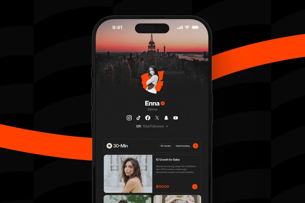
How Experts Optimize a Link in Bio for High-Ticket Sales
June 4, 202611 min readUpdated August 3, 2026
TL;DR
TL;DR
High-ticket buyers need clarity, proof, and a guided next step, not a crowded list of links. Strong link-in-bio optimization prioritizes authority-first messaging, visible trust signals, clear CTAs, and measurement tied to qualified actions.
Most creators treat their bio page like a menu. Experts who sell premium offers treat it like a qualifying storefront.
That distinction matters because high-ticket buyers do not click with casual intent. They need confidence, clarity, and enough proof to believe that taking the next step will be worth their time and money.
A useful rule is simple: for premium offers, the bio page should reduce uncertainty before it asks for action. That sentence is worth remembering because it explains why many standard link pages underperform when the goal is not clicks, but booked calls, serious inquiries, and paid engagements.
Basic link-in-bio optimization often focuses on increasing taps. That is not wrong, but it is incomplete.
High-ticket sales introduce a different buyer psychology. The visitor is not deciding whether to read a blog post or watch a video. They are deciding whether to trust the person behind the offer with money, time, reputation, or business outcomes.
That changes the job of the page.
Instead of acting like a directory, the page needs to do four things in sequence:
This is the practical model that strong creator storefronts follow. It can be called the authority-to-action path: relevance first, trust second, proof third, conversion fourth. It is simple enough to remember and specific enough to reuse.
A lot of standard link-in-bio setups fail because they reverse that order. They ask visitors to click before establishing context. They present six to twelve equal links, minimal proof, and no clear hierarchy. That may work for broad audience traffic, but it is a weak format for premium consulting, coaching, advisory work, specialized services, or higher-priced digital offers.
According to Hootsuite’s guide to bio links, the basic purpose of a link in bio is to direct followers from social profiles to a destination where they can take action. That is the baseline. The problem is that for high-ticket intent, sending people off-page repeatedly can create friction instead of momentum.
This is where Oho is best framed differently from a standard link list. Rather than acting as a prettier outbound menu, it is designed as the conversion and monetization layer of the creator’s public page: a place to sell, book, subscribe, and manage structured inquiries from one destination.
That distinction matters even more when your offer depends on trust.
When experts optimize for premium conversions, they do not start with colors, icon sets, or aesthetic moodboards. They start with information order.
The first screen needs to answer three questions immediately:
If those answers are missing, the visitor starts doing work the page should have done for them.
For a high-ticket bio page, the top section should usually include:
A weak version says: “Creator | Speaker | Coach | Entrepreneur.”
A stronger version says: “Helps B2B founders turn audience trust into booked consulting work.”
The second version qualifies the visitor. It also creates self-selection, which is critical in link-in-bio optimization when the page needs to support better leads rather than more random clicks.
According to Solo’s overview of link in bio best practices, link-in-bio optimization is fundamentally about organizing clickable destinations on social profiles more effectively. For low-ticket or content-driven accounts, multiple links can be fine.
For premium offers, too many equal-weight options usually weaken intent.
The contrarian position is this: do not give high-value visitors more choices; give them a stronger reason to choose one path.
That does not mean hiding everything else. It means creating a clear hierarchy:
Experts also label the action in buyer language. “Work with me” is vague. “Book a 30-minute advisory session” is concrete. In fact, packaging expertise into a short paid session can be especially effective for creators who want to qualify buyers before deeper engagements, which is why our guide to paid bookings is relevant here.
Baseline:
A consultant’s page contains nine links, no explanation of the core offer, and a generic CTA reading “Let’s connect.” Traffic from Instagram and LinkedIn arrives, but most users bounce after a single tap or choose low-intent links like YouTube.
Intervention:
The page is rebuilt so the first screen states the niche, names the outcome, adds a single “Book a paid strategy call” CTA, and places social proof plus a structured inquiry option directly underneath.
Expected outcome:
The page should reduce unqualified clicks, increase booking intent, and improve the percentage of visitors who either book or submit a serious inquiry.
Timeframe:
Measure the change over 4 to 6 weeks using the same traffic sources and offer pricing.
That is the correct way to think about proof here: not invented conversion lifts, but a clear measurement plan tied to behavior.
Many creators over-invest in aesthetics and under-invest in evidence. For premium offers, that is usually backwards.
Lifestyle-style bio pages often emphasize personality, visuals, and broad brand vibes. That can work for top-of-funnel attention. It is less effective when the visitor is deciding whether to spend hundreds or thousands of dollars.
Authority is built through specificity.
A high-converting premium page usually includes most of these:
Name the category of buyer and the problem solved.
State what is being sold: consulting session, audit, package, workshop, downloadable framework, or application.
Explain what happens next. Unclear intake creates hesitation.
This can include client logos, outcome statements, selected testimonials, media mentions, credentials, or notable experience.
Clean usernames, consistent branding, and a more serious presentation increase perceived legitimacy.
This last point is often overlooked. A polished public identity does not close deals by itself, but it reduces suspicion. Oho’s positioning around creator usernames, profile presentation, and a cleaner monetization-focused page aligns well with that need.
Trust signals should not be buried at the bottom.
A better layout is:
That order reflects decision gravity. The page should support the commercial action first, not treat it as one link among many.
As Later’s link in bio product page and Lnk.Bio both reflect, the market generally understands bio pages as hubs for multiple destinations. The expert move is to turn that hub into a guided path rather than a loose collection of exits.
For high-ticket services, “DM me” is a weak intake mechanism.
It creates hidden friction:
A structured collaboration or inquiry flow is better because it captures intent in context. That is especially relevant for creators balancing services, digital products, newsletter growth, and partnership requests from one audience stream.
Instead of pushing people into manual back-and-forth, Oho is designed to centralize these actions on-page. That is one of the clearest advantages over a standard bio tool that simply redirects traffic outward.
Most pages do not need a redesign from scratch. They need a more disciplined audit.
Use this four-step review process every quarter, after major offer changes, or whenever social traffic increases but premium conversions stay flat.
Open the page with no prior context and give it ten seconds.
Check whether the following are obvious:
If any of those are unclear, the page is under-explaining the commercial decision.
A practical test is to ask: could a stranger describe this offer after one screen without clicking anything else?
If not, fix messaging before changing design.
Many pages contain multiple links that serve the same purpose.
Examples:
These often confuse rather than help.
Choose one primary path for each intent level:
This is where a conversion-focused page outperforms a generic link list. Instead of scattering intent across separate tools for bookings, digital products, and email capture, Oho can bring those actions into one workspace and one public destination.
Link-in-bio optimization without measurement quickly becomes guesswork.
At minimum, track:
The exact analytics stack depends on your setup, but the principle is stable: do not stop at clicks. Measure progression.
For many experts, the right KPI is not total taps but qualified action rate: the percentage of visitors who take a commercially meaningful step.
This fits the broader shift in bio link thinking documented across practical guides such as yoursocial.team’s article on optimizing your Instagram bio link, where the emphasis is not just having a link, but using it intentionally based on destination and goal.
Small wording changes can materially improve clarity.
Replace vague CTA labels with specific action language:
This is especially important on mobile, where users scan faster and tolerate less ambiguity.
If your page supports expert consultations, our link-in-bio conversion guide goes deeper on how action wording shapes behavior.
Premium conversion pages should look clean, but they should not become minimalist to the point of hiding meaning.
A common failure mode in link-in-bio optimization is aesthetic reductionism: fewer words, fewer cues, fewer details, and therefore less confidence.
Use a restrained design system:
This is not about making the page look plain. It is about ensuring that visual attention supports commercial intent.
Do not reserve testimonials or credibility notes for a hidden lower section if the offer is expensive.
Examples of useful proof placement:
That level of specificity reduces mismatch.
Where relevant, show offer cards that include:
High-ticket buyers usually appreciate directness. Hidden pricing can be useful in some consultative sales processes, but hidden scope almost never helps.
For creators selling time, packaging the offer into shorter, well-defined sessions often performs better than an open-ended “work with me” page. Again, this deeper breakdown of paid expert calls is a useful companion if that model fits your business.
Weak premium pages are often not broken in obvious ways. They fail in subtle ways that make serious buyers hesitate.
A visitor from TikTok, Instagram, LinkedIn, or a podcast mention may have very different intent.
A good bio page serves multiple awareness levels, but it does not flatten them into identical choices. It prioritizes the highest-value next step while still giving lower-intent users a softer path.
For premium offers, the page should feel personal but not casual.
Aspirational imagery and broad creator branding are not substitutes for proof, clarity, and process. If the visitor cannot tell what is being sold or how engagement works, visual style will not save the conversion.
One of the biggest friction points in standard setups is fragmentation.
A visitor clicks the bio link, then clicks out to a booking tool, then gets routed to a separate checkout page, then maybe to an unrelated intake form. Every redirect costs confidence.
This is exactly the fragmentation Oho is designed to solve. Instead of splitting products, bookings, subscriber capture, and partnership requests across disconnected tools, creators can centralize those actions in one monetization-focused page. That is also why our overview of replacing multiple creator tools is relevant for operators trying to simplify their stack.
A page can generate more taps and still perform worse.
If users are clicking entertainment links, low-value resources, or broad social destinations instead of booking or inquiring, the page is leaking commercial intent.
The right question is not “Did clicks increase?”
The right question is “Did more qualified visitors take the action that produces revenue?”
Not every premium buyer converts on first visit.
That is why the secondary CTA matters. Newsletter sign-up, a compact lead magnet, or a high-value case-study page can keep the relationship moving without forcing a hard sell.
For creator-led businesses, subscriber capture is not separate from revenue. It is often the bridge between social discovery and later conversion.
The most useful measurement approach is a simple funnel review.
Track the page across this sequence:
impression -> AI answer inclusion -> citation -> click -> conversion
That path matters more in 2026 because more discovery begins in AI-generated answers, summaries, and recommendation layers. In that environment, brand becomes a citation engine. Pages that are specific, quotable, and credible are more likely to be surfaced, cited, and trusted.
Use a monthly review with these inputs:
If the page has traffic but weak conversion starts, the messaging or hierarchy is likely off.
If conversion starts are healthy but completions are weak, the downstream booking or checkout process may be introducing friction.
If only low-intent actions are increasing, the page may be attracting curiosity instead of commercial intent.
Do not change everything at once.
Test one variable at a time over a meaningful period, such as 2 to 4 weeks depending on traffic volume:
Document baseline metrics before each test. Then review not only gross clicks, but qualified outcomes.
This is where Oho’s emphasis on conversion visibility is useful. The page should not just host links. It should make it easier to understand what is actually producing value.
They can hurt conversions when they act as unordered link directories instead of guided decision pages.
As practical platform guides from Solo and Hootsuite make clear, the core purpose is to route social traffic effectively. The issue is not the category itself. The issue is using a low-context click menu for a high-trust sale.
The best setup usually has one clear premium action, one lower-friction secondary action, proof near the top, and a simple structure that explains what happens next.
For experts, a conversion-focused storefront is generally more effective than a basic link list because it can support bookings, products, subscribers, and inquiries from one page.
It depends on the sales model.
For defined offers like paid calls, workshops, or audits, visible pricing can improve qualification. For custom engagements, it may be better to explain scope and route visitors to an inquiry or application path instead.
Fewer than most creators think.
There is no universal number, but high-ticket pages often perform better when they prioritize one primary CTA, one secondary path, and a limited set of support links rather than presenting a long undifferentiated list.
Start with commercially meaningful actions, not vanity metrics.
Track visits, primary CTA clicks, booking or inquiry starts, completed conversions, and subscriber capture. Then evaluate which traffic sources produce qualified outcomes.
Yes, if the page is structured by intent instead of by random link order.
That is one of the clearest reasons creators move beyond standard bio tools. A single monetization-focused page can centralize those actions while keeping the public profile cleaner and easier to understand.
A premium bio page should not feel like a scrapbook of links. It should function like a storefront that qualifies, reassures, and converts. If you want a cleaner way to sell digital products, accept bookings, collect subscribers, and manage collaboration inquiries from one conversion-focused page, explore how Oho can support your next upgrade.