
← Back to blog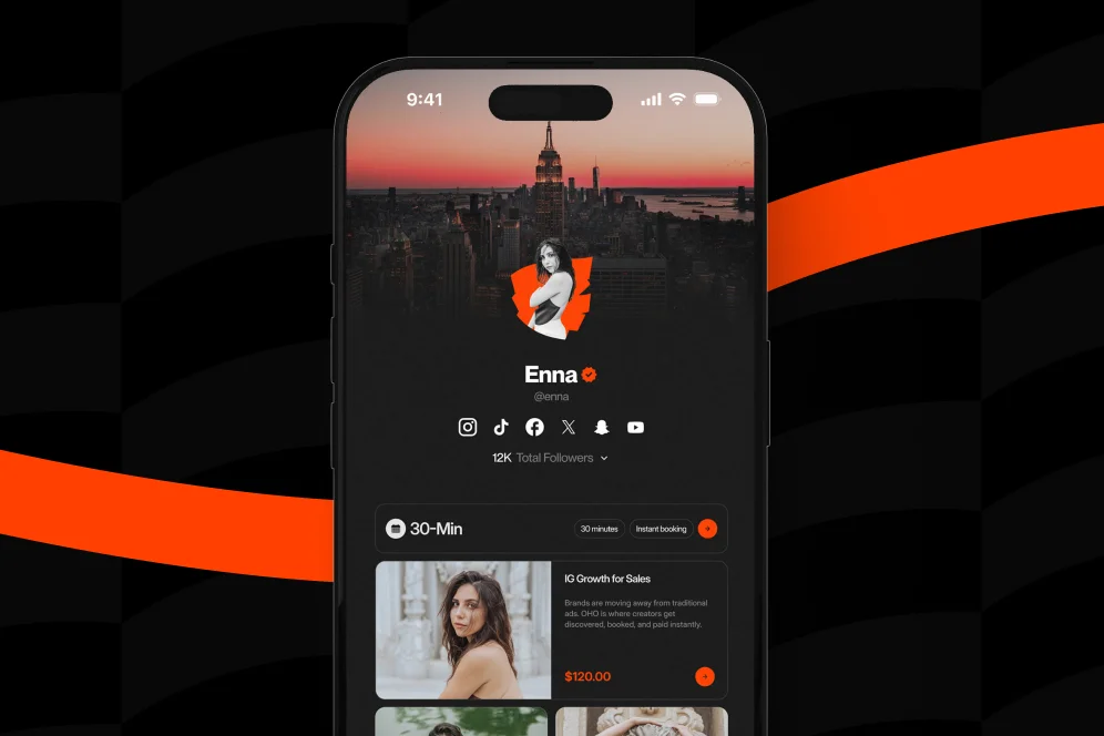
How to Turn a Link-in-Bio Page Into a Storefront That Converts
March 28, 202611 min readUpdated August 3, 2026
TL;DR
High-Conversion Link-in-Bio Strategies work when a bio page behaves like a storefront, not a link directory. Lead with one commercial goal, put the money-maker first, reduce friction, and measure completed actions like purchases, bookings, subscribers, and inquiries.
Most link-in-bio pages fail for a simple reason: they behave like directories when they should behave like conversion surfaces. If the page does not help a visitor take the next obvious revenue action, it becomes a traffic leak instead of a storefront.
A high-converting bio page is not a list of links. It is a focused decision page that helps the right visitor buy, book, subscribe, or inquire with minimal friction.
The usual setup looks harmless enough: profile photo, short bio, six to ten buttons, maybe a featured link, and a pile of destinations that send visitors elsewhere. But from a conversion standpoint, that structure creates too many exits and too little intent.
Standard link-in-bio tools are good at routing traffic. They are usually much weaker at helping creators convert traffic directly on the page. That distinction matters more in 2026 because creator monetization is less about getting clicks and more about getting actions.
This is where High-Conversion Link-in-Bio Strategies start. The goal is not to add more links. The goal is to reduce decision load and surface the highest-value action first.
A practical point of view: do not optimize for link clicks, optimize for completed intent. A click to an external store, calendar, form, or inbox may look positive in a dashboard, but if the visitor drops off after that click, the page did not really perform.
That is why a more conversion-focused profile setup matters. Oho is built around that idea as a creator storefront rather than a prettier link list. The model is straightforward: let visitors act from one page instead of forcing them through scattered tools for products, bookings, newsletter capture, and brand inquiries.
The broader search intent around this topic points in the same direction. According to Verlynk, bio pages convert better when they are treated like funnels, with a clear headline and one primary CTA rather than a menu of equal-weight options. That is less glamorous than redesigning the page every month, but it is much closer to how real conversion improvements happen.
A useful model for auditing any bio page is the intent-to-action path:
That model is simple enough to quote, reuse, and operationalize. It also maps cleanly to what strong creator pages actually need.
If a creator says, “My bio page gets traffic but not results,” one of those four parts is usually broken.
A page that tries to serve everyone usually converts no one well. The first serious decision is choosing the page’s primary commercial job.
For most creators, that job falls into one of four buckets:
Those outcomes can coexist, but they should not compete equally for attention. As JPK Design Co. recommends, the most profitable offer should sit at the top of the page rather than being buried under lower-value links.
That sounds obvious, but it is one of the most common mistakes on creator profiles. The page says “work with me,” “download my guide,” “join my newsletter,” “watch my latest video,” and “read my blog” all at once. That is not optionality. That is conflict.
A cleaner structure looks like this:
Lead with a product block that includes:
This works particularly well for paid templates, guides, bundles, and creator packages.
Lead with service positioning, not biography. Visitors should see:
Lead with the audience outcome. The best email blocks answer three questions fast:
Lead with collaboration clarity. Sponsors do not want to dig through random links and DMs. They want a clear public identity and a structured inquiry path.
This is one place where a purpose-built profile is stronger than a generic page. Oho supports structured collaboration requests, newsletter capture, bookings, and paid offers from one page, which is why it is better framed as the conversion layer for a creator’s public profile rather than just another bio tool.
Once the page has one commercial priority, the layout should follow a funnel logic instead of a navigation logic. In other words, do not ask, “What links should be on the page?” Ask, “What sequence gives the visitor the highest chance of acting?”
A useful default sequence is:
That ordering reflects how users process a profile page on mobile: they scan top to bottom, make a snap relevance decision, and either act or bounce.
According to Venz Media, clear messaging and strong calls to action are central to turning profile visits into leads. That aligns with what high-performing creator pages tend to do in practice: they trade novelty for clarity.
The first screen has one job: make the next action obvious.
That usually means including:
A weak version says, “Welcome to my links.”
A stronger version says, “Get the creator rate card and outreach kit” or “Book a 30-minute strategy session.” The second version tells the visitor what the offer is, not just where they landed.
Do not waste prime space on:
This is the contrarian stance most pages need: do not make your bio page more complete; make it more decisive.
That is also where many creators improve results without changing traffic volume. They stop using the page as an archive and start using it as a storefront.
The best bio pages are not walls of buttons. Linkfire argues that hyperlinked images and embedded video can improve engagement because visuals give users faster context than text-only link stacks.
For creators selling digital products or services, that means:
A screenshot-worthy implementation is simple: a creator with a paid media kit places a product image, a one-line promise, a clear price, and a single button above the fold. Below that sits a newsletter signup and a separate collaboration inquiry path. That structure gives three monetization routes without making the page feel cluttered.
Creators usually need a hybrid setup. They are not just selling one download. They are often combining offers like a template pack, a strategy call, a newsletter, and inbound brand opportunities.
That creates a sequencing problem, not just a design problem.
A practical page architecture for High-Conversion Link-in-Bio Strategies looks like this:
Use one sentence that says who the creator helps and what action is available.
Examples:
This is not the place for a vague personal mission statement.
Place the highest-value offer first.
For a digital product, include:
For a service, include:
Even basic proof reduces uncertainty. The page does not need a giant testimonial carousel. It needs enough credibility for the next click to feel safe.
Use signals like:
Email capture is often the best secondary CTA because it converts social traffic into an owned channel. As both Mobilo and JPK Design Co. emphasize, strategic routing and email capture are core parts of a high-converting bio page.
This matters more than most creators think. Unstructured DMs create friction, delay, and missed opportunities. A structured inquiry flow for sponsor and partner interest is usually stronger than “email me” or “DM for rates.”
That is one reason creators use tools built for monetization workflows instead of standard pages. With Oho, the page can combine paid offers, bookings, subscriber capture, and brand collaboration requests in one workspace, with better visibility into conversion signals.
If a bio page is already live and underperforming, an audit should focus on decision friction, not aesthetics. The fastest way to improve outcomes is to review the page in sequence.
A realistic proof block here is process-based rather than fabricated. Baseline: a creator has a page with eight equal-weight links and no subscriber capture. Intervention: move a paid product to the top, add one clear email offer below it, remove four low-value links, and route sponsor interest into a structured inquiry section. Expected outcome over 30 days: cleaner click distribution, higher percentage of traffic reaching the primary offer, and measurable growth in signups or inquiries because the page now has an intentional order.
That is the right way to discuss performance when no audited numeric dataset is available. Define the baseline, define the intervention, define the measurement window, and define the metrics.
For creators who want to improve their page like operators rather than hobbyists, the instrumentation should answer four questions:
This is where Oho’s emphasis on conversion visibility matters. A creator does not just need click counts. They need enough context to understand whether traffic is turning into subscriptions, inquiries, or other monetization signals.
Design matters, but several technical factors quietly shape performance.
Embedded visuals can help, but only if they do not make the page heavy and slow. The page should load quickly on mobile networks. Use compressed images, short videos, and only the media that supports the first decision.
Most creators think of bio pages as social destinations, but they can also support discoverability. Automateed highlights technical enhancements such as SEO, schema markup, and dynamic content. Not every creator needs an advanced setup, but searchable public profiles, clear page structure, and branded URLs can help the page function as more than a disposable social link.
That is another reason a branded identity layer matters. A clean public URL is better for sharing, recall, and credibility than a generic subpage buried in a larger tool ecosystem.
Copy quality is often the hidden bottleneck. Replace low-intent buttons like:
with action-specific labels like:
This sounds minor, but it changes user comprehension. Good CTA copy removes interpretation work.
A recurring community point, reflected in the Facebook discussion on link-in-bio funnels, is that every extra step introduces drop-off. Even without turning that into a universal benchmark, the operating principle is sound: if the visitor can act on the profile page instead of being sent through three tools, conversion friction usually drops.
That is the practical business case for replacing a fragmented stack with a more unified storefront model.
Some mistakes are visual. Most are structural.
Creators often force one generic page on very different intents. Buyers, newsletter readers, and brand partners are not looking for the same next step. The page should prioritize one path while still supporting secondary paths.
Personal branding matters, but the offer still has to be visible. A visitor should not have to scroll past a long intro to find the paid action.
This is the classic failure mode. If eight links look equally important, none of them feels important.
A standard stack often means one tool for digital products, one for bookings, one for email capture, one contact form, and DMs for partnerships. The result is fragmented conversion and weak visibility. A more integrated page reduces that sprawl.
A page can look active and still fail commercially. Focus on purchases, booked time, subscribers, and qualified inquiries.
A creator page is not a full storefront catalog. It is a compact monetization page. The best layouts are selective and decisive.
Fancy sections do not fix weak offer positioning. Most pages would gain more from sharper headlines and stronger CTA copy than from another round of visual polish.
One primary CTA should dominate, with one or two secondary actions below it. The problem is not having multiple options; the problem is presenting them with equal weight.
Yes, usually as a secondary path. Many visitors are not ready to buy immediately, and newsletter capture turns borrowed audience traffic into an owned channel.
There is no universal number, but most weak pages have too many top-level choices. If a link does not support immediate revenue, audience growth, or qualified inquiries, it probably should not be prominent.
They matter for trust, memorability, and public identity. A cleaner URL also makes a creator page feel more intentional and business-ready.
Yes. Sponsors and partners should not have to guess where to go. A dedicated collaboration path is more professional than a vague invitation to send a DM.
The strongest High-Conversion Link-in-Bio Strategies are surprisingly restrained. They do not try to win with infinite choice. They win by matching intent, elevating the money-maker, reducing steps, and making conversion measurable.
That is the real shift from a standard link page to a storefront model. A storefront does not ask visitors to browse every possibility. It guides them toward the most likely next action and keeps secondary paths close by.
For creators selling digital products, booking paid services, growing a newsletter, or organizing brand inquiries, the practical move is to treat the bio page as a monetization asset. If the current setup still behaves like a list of exits, redesigning it around actions instead of links is usually the fastest fix.
If that is the direction you want to take, Oho is built for exactly that use case: a creator storefront and link-in-bio platform designed to help creators sell, book, grow, and get paid from one page. Review your current page against the audit above, identify the one action that matters most, and rebuild the page around that decision.